Okay, while I say that this is an exchange item--I'm not going to post it up unless someone specifically says they want it. It's a rather item-intensive house with a lot of store items (no-CC, though), and that tends to make things rather pointless to upload (that and I'm just lazy)... But, if anyone has a hankering for a country-themed house and is too lazy to build one--well, I've got one?
So, this house is built specifically for Future Bradley, when he's actually able to afford it, is looking to have kids, yada yada. You'll see later why it's so obviously for Brad; I could picture Amelia living in it, but she's likely going to be inheriting Jeb and Mere's house eventually. I'm still not sure yet.
In any case, this house is built on the lot where Juan Darer's house used to be in Twinbrook; 30x40 lot; 3BR, 3BA, with some few little extras that make it kind of spiffy.
As the name says, the house is sort of 'country' themed, but I may have taken a few liberties here and there that aren't quite country... I dunno. I don't even particularly care about 'theme'; I just like my houses to look cozy and lived-in. 'Country' just inspired a couple of rooms and patterns and such, so--that's what it's called, at least for now.
So, let's begin the tour.
This is what the house looks like from the front (obviously). As you can see, there's a one-car garage, a big windmill, pretty white fence, and... shutters. Nothing really special quite yet.
There's a bit of a front porch, and actually some pink flamingos on the front lawn--there's really not much more to see than that in the front.
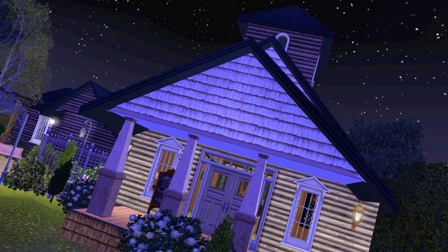
And this is what it looks like at night.
I've got the 'eco' windmills placed in various places all over the lot; the solar panels and windmills are a bit expensive to really make them feel like they 'earn' their worth back in savings in the long run, but I don't get a chance to use them very often since they look out of place in most lots.
From this angle you can kinda see the upstairs deck on the back of the house, which is empty except for a telescope. For now.
One of the little "cool" things about the property is that it's got a treehouse. I KNOW. How awesome is that?!
It's not very big, but... Well, most treehouses aren't. It's not really built directly *into* a tree, because while I would've liked that, it makes it very hard to take screenshots inside it because camera mode will see all the branches and stuff--which isn't pretty. The building itself isn't all that pretty either, but it's purpose isn't to be beautiful. ;)
Still, it's another thing I've wanted to do for a while and only now have both the yard space and the right 'style' of house and lot to make it fit.
Only other thing exciting about the house's exterior is the mini little swamp-pond directly behind the house. I plan to catch a ton of frogs and place them in there, because frogs are the most annoying food to keep handy.
Yes, I know I could just place a frog spawner somewhere in town--but that would make things *too* easy. Besides... Frog pond in the backyard? So cool.
The rest of the yard is pretty plain; for now, it's mainly just a few trees, open space, and a small garden area behind the garage. That will probably change as time goes on, but I like having a large space to work with in case I need to expand or build a nicer deck or something.
So, here's what it looks like directly upon entering the house -- minus some changes made after this screenshot was taken (you'll see what I mean in the next screenshot.)
The room's a bit too open and blank right here, which sort of bugs me -- I may add a rug later, but I just wasn't feeling it at the time I made the house initially.
Swivel 180!
Alright, this is where you can see the changes I made; the wallpaper is lighter, the coffee-table was replaced with that awesome deco table object from the Provence set (along with the mirror); the retro record player is from the T-Mobile site, if you don't recognize it.
I'm still actually not happy with that particular wallpaper, but every time I change it I just get more irritated with it, so that's how it's going to stay for now.
So, back on the opposite side of the room is the sitting/reading room; it's got a cute little half-barrier with a pillar, which always makes an awesome way to break up a large room without adding too many enclosing walls. I love open-concept.
Here's another angle of the sitting room; I always love little nooks with fireplaces, they make perfect places to cuddle, ammiright?
The are a couple of things I don't like about this at the moment (like the giant planter of flowers on the little endtable, that's going to be changed eventually), but all-in-all I think I achieved the effect I was going for, so this will probably remain mostly unchanged until I move Sims in and have hand-made objects to use as decor.
Next to the 'nook' is the archway leading to the kitchen and the stairs upstairs; also you can see the door that leads out onto a small deck (with a grill), but since that's not all that interesting, so we'll go to the kitchen first.
Okay, so I'm not really sure this is country-ish, but I love red-checkered type color schemes. It's kinda the coloring my hubby and I would like to do in our own kitchen someday (well, he wants more red and black, but whatever), and I don't even think I realized I designed the kitchen like that until after I'd finished. Freudian build slip? Who knows.
I still may continue to change the overall color scheme, but I'm pretty happy with the way I have it right now.
Here's another view, showing what it'd look like with a high-chair.
So, this is what the kitchen actually looks like now, with some editing after I was oh-so-awesomely gifted the Provence set (<3!); as you can see, there's now a breadbox, different cabinet and sink, some pails, and a different light. I also changed the color of all the wood, because the stricking orange-yness of the wood just didn't jive with the look I was trying to go for.
However, I do need to change the overhead light back to a "Flame" color, because with white, the room looks a bit too pastey. I think I may change the countertops to something less modern looking, too; still not too sure.
Again, this is still all subject to continue to change, but I see houses like this more as a neverending work-in-progress, that only really is slowed by Sims actually moving in.
So here's the dining room (much better lighting, I definitely like the 'flame' color from lights over the 'white' color in the previous screenshot). Lots of nice big windows to let in light, so it acts a bit like a 'sunroom' type of dining room. At least, during the day!
More Provence-y awesomeness, too. Yay!
Here's another angle, showing the wall-hangings and the door back into the kitchen.
It's a fairly simple little dining room, but the beauty is actually mostly in the day-time, when you can see the entire town through all the windows; that's what I love the most about this lot--it overlooks almost all angles of Twinbrook, which is a pretty spiffy view.
If you turn around and head strait back to the entry-way, you'll find the archway leading into the nursery. As is fairly obvious, it's got a rather feminine theme... This is because I'm tired of making non-gender specific baby rooms, and this is just wishful thinking that Brad's mate will give me a little girl. We'll see?
Another angle. Still haven't decided entirely on the coloring of lights in here, but I'm sure I will by the time Brad gets to move in, cuz... Yeah. That's a LONG time away still.
Off the nursery 'play room' is the 'sleep room', which features a crib and some horribly out of place paintings.
I'm so sick of having to use the same kid's room paintings. They also don't fit the room at all, and.. agh. I think I'm just going to remove them. Babies don't look at pictures on the walls, anyways.
Another shot of the unmatching wall hangings. (Ugh. I'm almost tempted to use CC just so I don't have to stare at those ever again.)
In the meantime... Pink and white plaid is pretty freaking adorable. And I don't usually go for adorable-ness.
It's a rather simple little nursery setup, but I'm pretty happy with the result--wall hangings aside.
The wall-hangings in here are moderately better, but still not my favorite. It's obviously a little girls room (or a feminine little boy, not discounting that yet!); nothing all that special about it. It's pretty small, but, I prefer the kids get out and do other stuff anyways.
Downstairs bathroom!
So, this is the room that a Sim will come up to when they first walk up the stairs. It's a TV room, basically; not that big, not that fancy. It's meant to be more of a 'den' then a cute sitting room like the room downstairs.
And... I hate it. I plan on changing it as soon as I get a better idea of what to do with it, but as of right now I keep running a blank. I've made a few changes since I took this screenshot, but I'm still not all that happy with it.
Namely, the issues I have with it are the wallpaper, the patterns on the carpet/loveseats, and the layout. Oh, and the wall-hangings. (Why does it always come back to the wall-hangings?)
Here's another angle; yeah, pretty plain. Like I said, I'm going to change it--and it's probably going to involve a lot of sim-snapped photographs, but since I only had a couple on me, the walls are pretty bare.
This room's probably going to see the most changes, once I figure out what changes those are exactly.
Once you exit the landing/TV room, you come into this room, which is basically just a small area that leads into a hallway towards the rest of the rooms on this floor. Very simple, but, I like the colors. Robins egg blue is pretty!
Here lies the master bedroom; nice and simple and cozy.
When peoples move in, I plan on putting up more photographs in here, too. (Well--everywhere.) It looks a bit plain right now because of that, but sometimes plain is better.
Guest room/boys bedroom, whatever. I plan on hanging up all of Brad's fishing trophies in here, which is why this room is also fairly blank.
Itty-bitty study. No computer, because I've already wasted enough of my life trying to get my Sims to do something other than sit in front of the computer playing games all day.
... Oh wait. I wonder if *my* Sim-overlord has that same problem with me?
... Er. >.> Moving on.
Here's one angle of the Master Bathroom; there's a few things I'd like to add to it, but I couldn't get them to fit properly in playtesting and I didn't have the patience to work it out when all I was really in there to do was take screenshots.
Mini-bath, that will have a change of wall decor once I find something better suited.
So, here is officially my favorite room in the house, even though it's not actually in the house--this is the room that's above the garage, and it's essentially Brad's future workshop.
On top of having cool light contrast--we all know how much I love coloring lights--it's crazily over-stuffed, which looks basically how I imagine any respectable inventor would have his workspace. A disaster, of course!
(My favorite room in the house is a disaster... What exactly does that say about me?)
And, here's what it looks like from the other side; there's some shelves for storing inventions, warning cones, an oil can, and other rusty and broken down objects.
The small room around the bend is a place to shower, should Brad find himself caught on fire and need to be rescued.
My second favorite part of the house is this--the treehouse. There's really nothing to it; it's basically just a 3x3 room on stilts, which--as you can see from this image--can only be gotten into via a fire-pole.
The inside doesn't have a whole heck of a lot in it right now, but that's how you'd expect it to be--you can't very well fit very much in through that dinky little hole. What's in there right now is just randomly placed clutter, but later on I'll find a use for this as a fort for kids, or something to that effect.
Well, that about does it, but in case you're curious, here's a top view (even though I know floor-plans are essentially pretty dull to look at). The garage is off to the right, hiding, because it's not as complicated as the rest of the house.
Aaaaand, the top floor.
Well, that's it! Lemme know what you think, if you want me to put it up on the exchange, if there's any major suggestions you have, etc etc. I tend to build houses like this for future generations far, far in advance so that I have it exactly as I'd like it--and, as I've mentioned several times, there's a lot of things I'm not really totally happy with that I wouldn't totally object to some feedback on. ;)
Until next time, ciao, and enjoy the rest of your holidays!
New Changes:
New change to the wallpaper in here; added a long rug.
The kitchen restyle; looks much more country now!
Some changes to the 'den' via patterns and layout; still not perfect, but better.
Read more...